
An UI/UX case study of an emerging local bicycle brand
Overview
Roar Bikes is a manufacturer of small run, contemporary bicycles sold exclusively from their own website. They currently have 3 models of bikes to purchase having at least 4 different versions for each.
The bikes are customizable and unique in a way that professional sport bikers fancy. They also cater to the simplicity and dapper personalities of commoners who like to cycle their way to workplaces or just prefer mosey round the city.
This project is actually part of a design course by Daniel Walter Scott on Udemy called “User Experience Design Essentials — Adobe XD UI UX Design”. It is a class project at the end of the course to test the newly developed skills.
Project Duration
8th April 2021–24th April 2021
Design Process
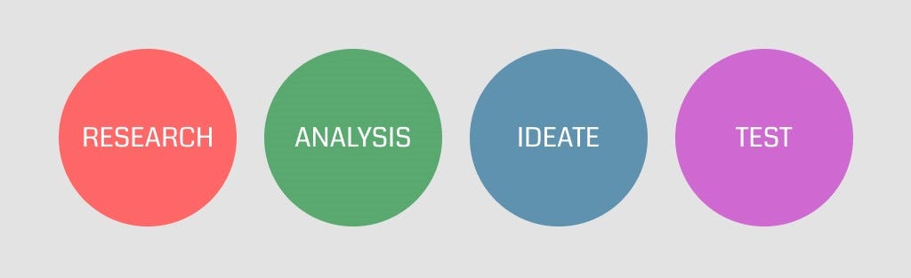
Drawing from the traditional design process, I’d divide it as Research-Analysis-Ideate-Test
Research
With User Persona at hand, I started my research with understanding the nature and needs of the average customer and how I could meet the best of their wants into the design effectively and provide for a smooth experience. To get a better grasp I also read a few customer reviews on trustpilot and other bicycle websites to know the problems they had while making a purchase.
Apart from this I did a comparative research of three major bicycle brands — Yeti cycles, Swifty Scooters and Santacruz Bicycles who could be the strong competitors for Roar Bikes to get a basic idea of what a bicycle website usually looks like. I tried to catch on the overall structure, user flow, micro-interactions, usability and other aspects of design. Also this being a class project I had several other versions of Roar Bikes from fellow classmates to be inspired from.
Analysis
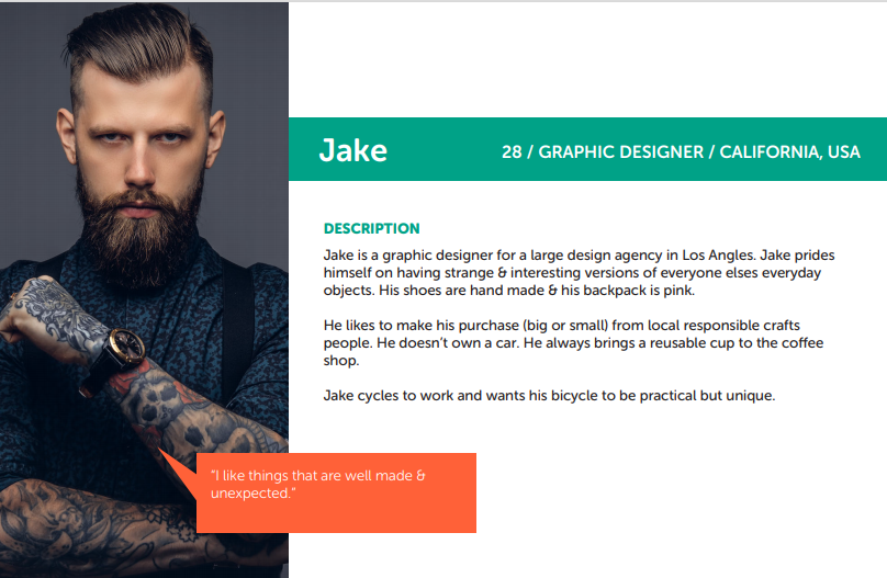
Being a designer himself one can collect form the user persona that Jake must value design that stands out. He has a unique perspective for mundane things and is a big supporter of local crafts among other things. Hence, the webpage should look edgy, gripping and at the same time shouldn’t lose its esse of being an easy-going, not too flashy, simple local brand.
From the reviews it turned out customers mostly had issues with the bikes and its pricing but for a few the instructions weren’t clear.
Coming to the UI of the previously mentioned bicycle brands, I particularly liked the user flow of the Yeti cycles website. Its product page is engaging but requires a lot of scrolling for information about features, details and geometry. Santacruz bicycles have made a separate nav link for each one of those which eases the task. Swifty scooters has a clean and precise product page but not much different than any other e-commerce website.
Ideate
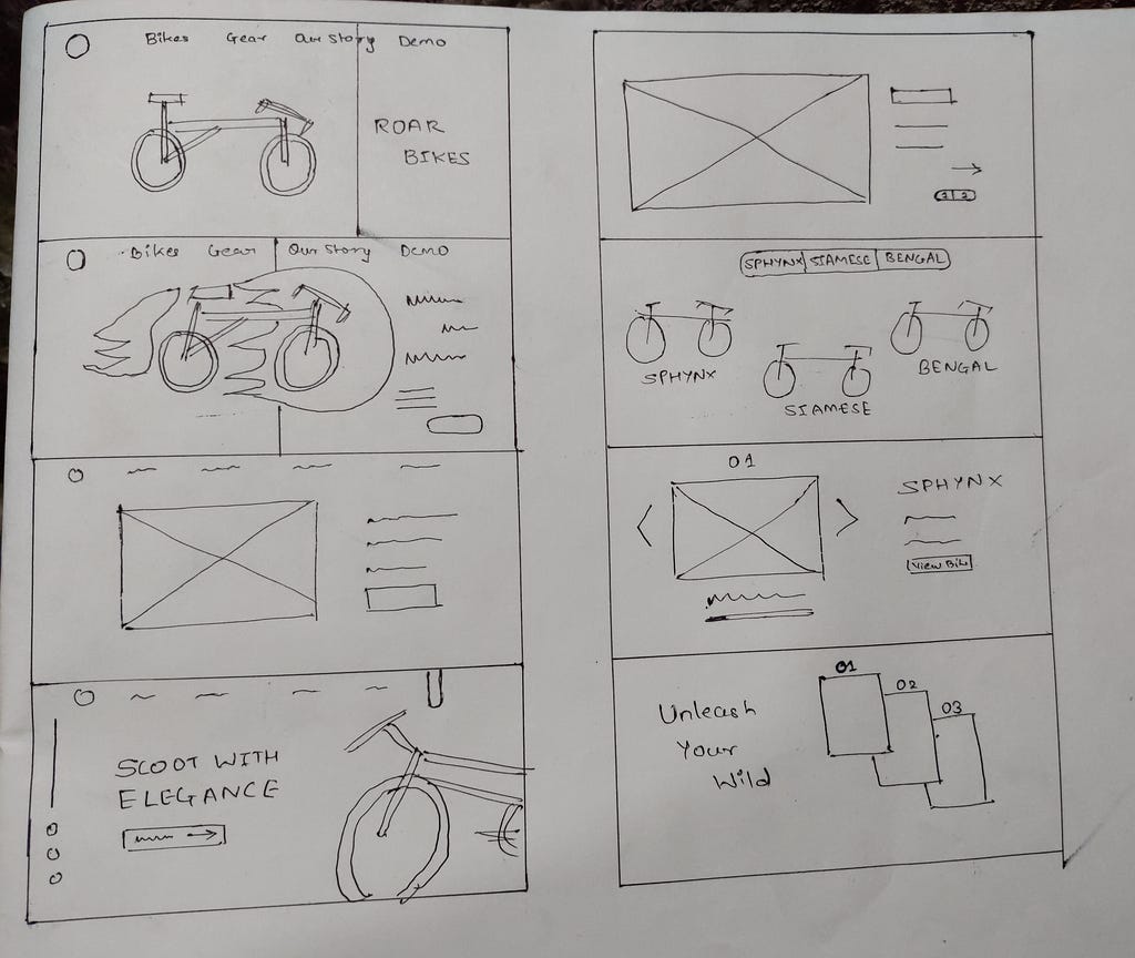
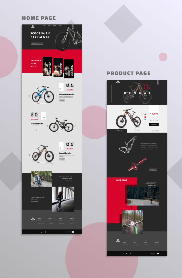
After getting an idea of the overall structure of a bicycle website I drew a few rough wireframes on the paper. By tweaking and retweaking it again and again I created a few versions of it.
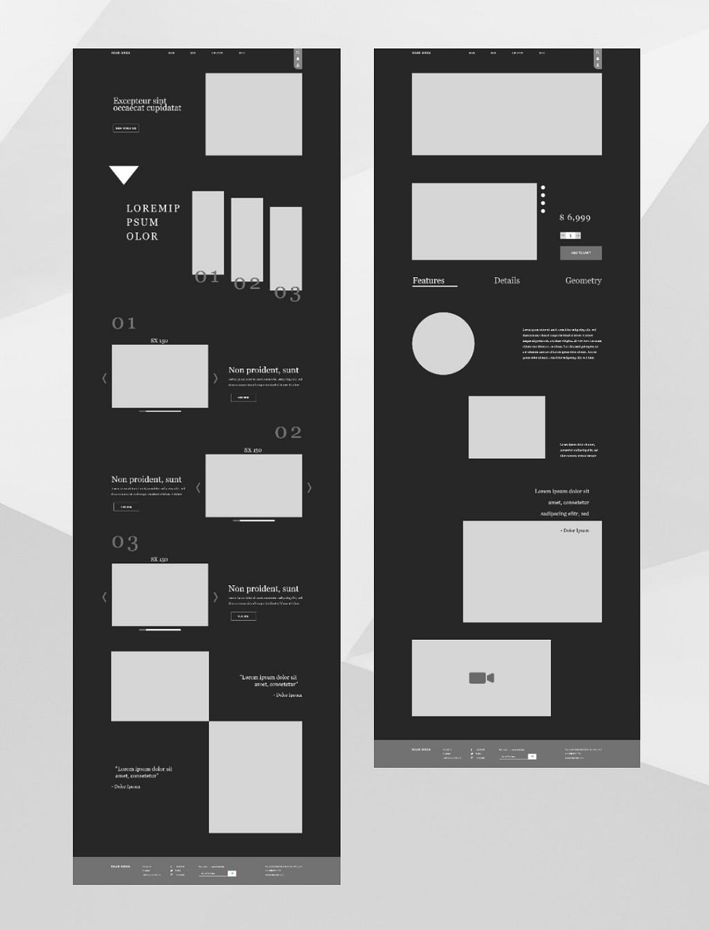
Clinging to the mood board I chose a color theme that looked modern, exciting and clean. To make the website engaging I implemented the parallax scroll and made the elements on the page bigger in size to take up the most screen resolution but also let them breathe with providing enough whitespace. It also made them stand out.
Picking the best of the items from the inspirations I had, I separated the features, details and geometry and made each section fun to scroll down. This also meant there would be less confusion on getting any information regarding the bikes.
Testing
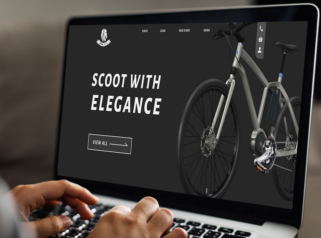
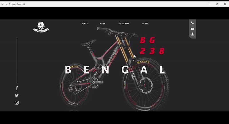
I was taking feedback at almost every stage of creating the Visual Design. My elder brother would suggest me changes right from the colors that I used to the size of page elements. The first thing he didn’t like about the website was the almost black color I used for the hero slider. He said that the website should look ‘welcoming’ and not ‘intimidating’. Although I agree with him I also wanted it to look edgy; many a times the user doesn’t know what’s really off, colors are easy to blame. So, I tweaked the color slightly and experimented with different typeface, font size and design elements and it worked.
He didn’t seem to have much problem navigating on the prototype except for the fact that it was unclear which buttons were clickable. I also tested it with a friend who had the similar problem.
Now for unmoderated testing, I had shared the prototype within a few design communities on Discord and they had some great insights over a few confusing sections that needed to be corrected, consistency and colors of course. I made the necessary changes and it was fine then.
Apart from that I also created a project on Useberry and shared the link with some of my friends without them knowing what they were getting into. As a result few of them dropped off. The task was to get to the product page of Bengal Bikes. I watched the session recordings and it seems like people were confused because they didn’t know which buttons worked and hence they skipped the task. Out of 8 people 4 could complete the task successfully.
Conclusion
What I learnt?
It’s important to make your website relatable to the user. They should feel welcomed and colors have a lot to do with how they perceive the website.
I also tried my hand on copy writing. I’ve written a few articles as a content writer before but copy writing is very different as it needs to be attractive and precise at the same time.
Also it’s really difficult to maintain users’ attention on the page! People have short attention span and +skipping habit because of which most people didn’t even read what the task was.
What would I change?
There is a scope for a lot of changes like changing the images, typeface and even user flow but it all should blend well together as a whole. More micro interactions can be added to make users remember their last actions and just have a fun experience.
In future…
I’ll try to make designs that are less confusing. This was my sincere effort in learning UI/UX Design and my first proper project. I’m sure I can do better but this is it for now. It was a great learning experience, from user research to user testing and there’s still a lot to learn. Iterating new ideas with a creative block is frustrating but to keep the creative juices flowing is something a designer needs to work upon with constant daily efforts.
And that’s that friends. Thanks a lot for staying till the end!
Case Study: Roar Bikes, an E-commerce website was originally published in Muzli – Design Inspiration on Medium, where people are continuing the conversation by highlighting and responding to this story.