How American Life Expectancy Compares to Its Peers
This was originally posted on our Voronoi app. Download the app for free on iOS or Android and discover incredible data-driven charts from a variety of trusted sources.
Key Takeaways
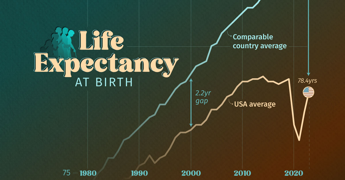
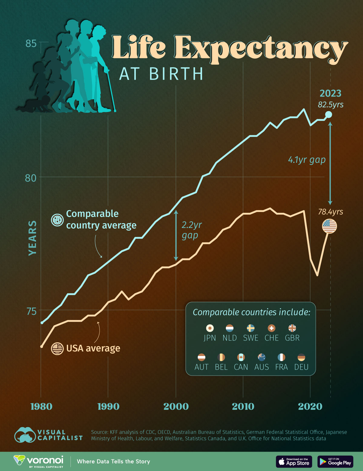
- American life expectancy at birth is falling further behind that of comparable nations
- The gap has increased from 2.2 years in 2000, to 4.1 years in 2023
For decades, Americans could expect to live about as long as their peers in other wealthy countries—but today, that story is changing.
Based on a 2025 analysis by Peterson-KFF, American life expectancy is now lagging significantly behind comparable nations, with the gap growing wider than ever before.
From chronic diseases to healthcare disparities, multiple factors are contributing to Americans dying younger. In this infographic, we take a look at how the U.S. stacks up—and how quickly it’s falling behind.
Data and Discussion
The data we used to create this graphic is included in the table below.
The comparable country group is based on averages across 11 nations: Australia, Austria, Belgium, Canada, France, Germany, Japan, Netherlands, Sweden, Switzerland, and the UK.
| Year | U.S. (yrs) | Comparable Country Average (yrs) |
|---|---|---|
| 1980 | 73.7 | 74.6 |
| 1981 | 74.1 | 74.8 |
| 1982 | 74.5 | 75.1 |
| 1983 | 74.6 | 75.3 |
| 1984 | 74.7 | 75.7 |
| 1985 | 74.7 | 75.7 |
| 1986 | 74.7 | 76 |
| 1987 | 74.9 | 76.4 |
| 1988 | 74.9 | 76.5 |
| 1989 | 75.1 | 76.7 |
| 1990 | 75.4 | 76.9 |
| 1991 | 75.5 | 77.1 |
| 1992 | 75.8 | 77.3 |
| 1993 | 75.5 | 77.4 |
| 1994 | 75.7 | 77.8 |
| 1995 | 75.8 | 77.8 |
| 1996 | 76.1 | 78.1 |
| 1997 | 76.5 | 78.4 |
| 1998 | 76.7 | 78.6 |
| 1999 | 76.7 | 78.7 |
| 2000 | 76.8 | 79 |
| 2001 | 77 | 79.3 |
| 2002 | 77 | 79.4 |
| 2003 | 77.2 | 79.5 |
| 2004 | 77.6 | 80.1 |
| 2005 | 77.6 | 80.2 |
| 2006 | 77.8 | 80.6 |
| 2007 | 78.1 | 80.8 |
| 2008 | 78.2 | 81 |
| 2009 | 78.5 | 81.2 |
| 2010 | 78.7 | 81.4 |
| 2011 | 78.7 | 81.6 |
| 2012 | 78.8 | 81.6 |
| 2013 | 78.8 | 81.8 |
| 2014 | 78.9 | 82.1 |
| 2015 | 78.7 | 81.9 |
| 2016 | 78.7 | 82.2 |
| 2017 | 78.6 | 82.3 |
| 2018 | 78.7 | 82.3 |
| 2019 | 78.8 | 82.6 |
| 2020 | 77 | 82 |
| 2021 | 76.4 | 82.2 |
| 2022 | 77.5 | 82.2 |
| 2023 | 78.4 | 82.5 |
Higher Spending, Lower Life Expectancy
According to Peterson-KFF, the U.S. has the lowest life expectancy among large, wealthy countries despite outspending its peers on healthcare.
In 2023, health spending per capita in the U.S. climbed to $13,432, versus $7,393 for the same 11 nation peer group.
This disconnect suggests inefficiencies, unequal access, and other systemic problems in the U.S. healthcare system are preventing resources from translating into longer, healthier lives.
Chronic Diseases Drag American Life Expectancy Down
A key factor behind the stagnation of life expectancy in the U.S. is the rising prevalence of chronic diseases.
This includes kidney disease, which in 2021 claimed 41 lives per 100,000 in the U.S., versus just 28 per 100,000 for the comparable country group.
Learn More on the Voronoi App 
If you’re enjoying our content, check out this graphic showing global obesity projections by 2050 on Voronoi, the new app from Visual Capitalist.
The post Charted: How American Life Expectancy Compares to Its Peers appeared first on Visual Capitalist.