Hype&Hyper Magazine Branding
abduzeedo06.21.21
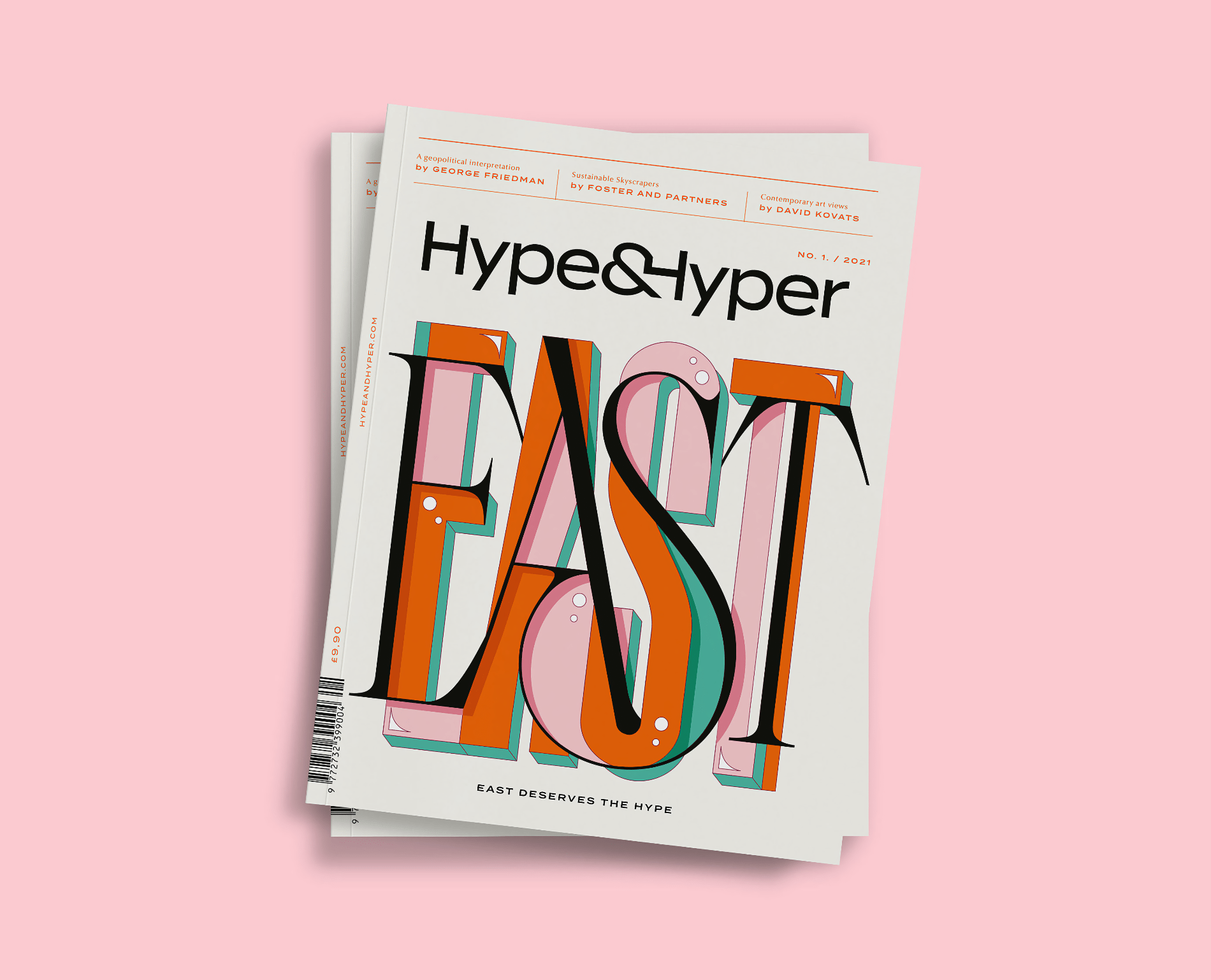
kissmiklos was commissioned to work for Hype&Hyper new visual identity and printed magazine design. HYPE&HYPER is a design and lifestyle magazine covering innovation, urban life and creative ecosystems across Central and Eastern Europe.
They made a san serif logotype with a nice ‘&H’ ligature inspired by retro photos and interiors, Central and Eastern European design, that’s why the whole identity is based on pastel and vivid colors. Kissmiklos really enjoyed working on funny illustrations and colorful custom types.
Thanks to the HYPE&HYPER design team for their support (László Bárdos thanks for animated my illustrations) and Júlia Bethlen (layout editor) for working together. Thanks to my wife Eszter Sarah for the beautiful campaign photos, and thanks to Gergely Fáy, (owner of HYPE&HYPER) for the trust.
For more information check out hypeandhyper.com or
- Order the magazine: HERE
- Try and download: Chloé Typeface
Also make sure to check out kissmiklos on

